自适应
尺寸感应:屏幕的尺寸发生变化的时候有能力感应到屏幕的变化
数量单位:关注多种单位,而不是单单的px
弹性元素:主流浏览器对弹性元素支持越来越好
CSS与弹性相关
@media:用css感知屏幕尺寸设置不同样式
const Wrapper = styled.section`
  display:grid;
  place-items:center;
  height:100vh;

  background: yellow;
  @media screen and (min-width: 768px){
    background-color: green;
  }
  @media screen and (min-width: 992px){
    background-color: coral;
  }
  @media screen and (min-width: 1200px){
    background-color: purple;
  }
`
以上会在屏幕尺寸达到1200px时设置颜色为purple,992为coral,768为green,小于768为yellow
const Card = styled.div`
  background-color: #fff;
  height: 30vh;
  margin: 0 auto;
  width: calc(100% - 60px);
  @media screen and (min-width: 768px){
    width: calc(100% - 120px);
  }
  @media screen and (min-width: 992px){
    width: 800px;
  }
`
以上会在屏幕尺寸达到992时设置Card固定宽度800px,768时会在两边各空60px,小于768两边各空30px
以上就是media screen在css里怎么去感知宽度,上面随着宽度的变化高度并没有变,有些时候希望高宽比是一个定比
我们先去掉Card里面的高度height:30vh,然后定义一个子元素把他撑开,子元素padding的百分比是根据父元素的宽度来定的,这样就实现了Card随着宽度的变化高度是其宽度的50%
const RatioPlaceHoder = styled.div`
  padding: 0 0 50% 0;
`
<Card>
    <RatioPlaceHoder/>
</Card>
这个时候怎么往里面写元素呢
首先可以给Card设置一个相当定位position: relative;,然后定义子元素容器
const RatioPlaceHoder = styled.div`
  padding: 0 0 50% 0;
`
const RatioContent = styled.div`
  position: absolute;
  top: 0;
  left: 0;
  width: 100%;
  height: 100%;
`
function App() {
  return (
    <Wrapper>
      <Card>
        <RatioPlaceHoder/>
        <RatioContent>
          hello
        </RatioContent>
      </Card>
    </Wrapper>
  )
}
这样RatioContent就是一个保持宽高比的正常的容器了
我们使用一种不使用media screen的方式来适应宽度,那就是width与max-width结合
const Card2 = styled.div`
  height: 30vh;
  background-color: #fff;
  margin: 0 auto;
  width: 80%;
  max-width: 800px;
`
默认宽度是80%,但是当80%的宽度大于800px时,就固定800px
同时还可以使用其他函数把两个属性结合起来使用width: min(80%,800px);
还可以使用clamp函数设置适应方式,如width: clamp(600px,80%,800px);,clamp设置了一个最佳值80%,但是最小不低于600px,最大不大于800px。
em与rem:
rem相对于根元素的font-size,默认是16px
em相对于当前元素的font-size,font-size会继承,当前没有设置就是设置了font-size的某个父级元素,直至根元素
在JS脚本监听
flex
首先我们先写一些div的普通嵌套
import React from 'react'
import styled from 'styled-components'

const Main = styled.main`
  width:100vw;
  height: 100vh;
  background-color: hsl(180,9%,18%);
  display: flex;
  justify-content: center;
  align-items: center;
  & code {
    font-size: 3rem;
    color:hsl(30,12%,24%)
  }
  & h1,h2,h3,h4,h5{
    color: hsl(210,72%,77%);
  }
`
const FlexContainer = styled.div`
  background-color: hsl(180,10%,50%);
  width: 86%;
  height: 86%;
`
const FlexItem = styled.div`
  background-color: hsl(180,80%,30%);
  border: 7px solid hsl(60,70%,80%);
  color:hsl(50,100%,50%);
  font-size: 1.5rem;
  font-weight: bold;
`
const SomeItems = ()=>(
  <>
    <FlexItem><h2>hello</h2>world</FlexItem>
    <FlexItem>hello world</FlexItem>
    <FlexItem><h3>hello</h3>world</FlexItem>
    <FlexItem>hello world</FlexItem>
    <FlexItem><code>hello</code>world</FlexItem>
  </>
)
function App() {
  return (
    <Main>
      <FlexContainer>
        <SomeItems/>
        <FlexItem><h1>Hello world</h1></FlexItem>
        <FlexItem>The flex CSS shorthand property sets how a flex item will grow or shrink to fit the space available in its flex container.</FlexItem>
      </FlexContainer>
    </Main>
  )
}

export default App
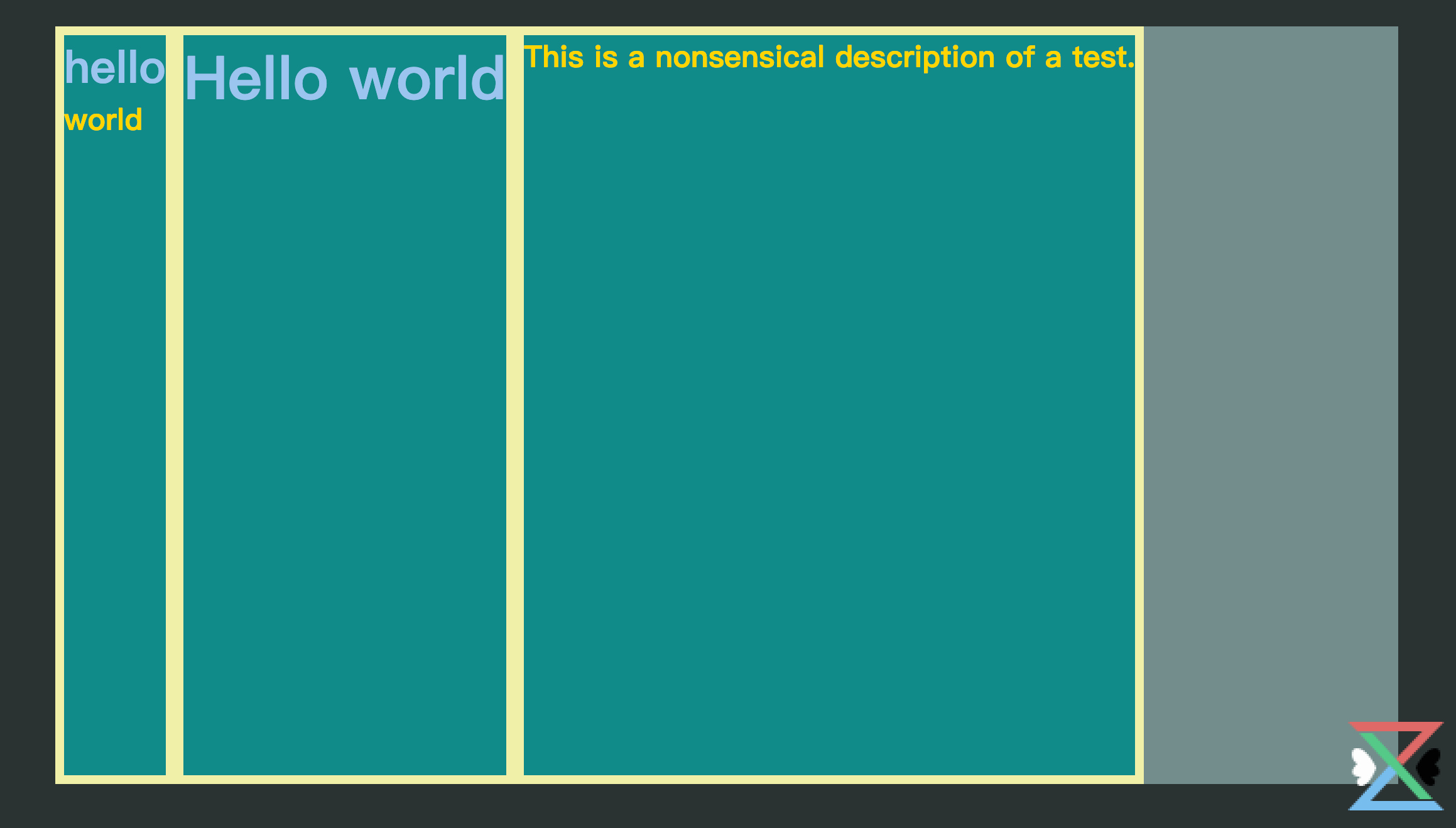
我们看到的样式是这样的

我们把FlexItem设置成行内元素display:inline-block;,这些元素就相当是一个单词,在一行放不下自动放到下一行

我们知道width,可以设置属性max-content和min-content,设置了inline-block无效
width: max-content;:不换行,宽度是所有内容的宽度

width: min-content;:自动换行,最宽的一个单词作为盒子的宽

flex很像一个段落里面的单词
我们在FlexContainer中开启flex**display:flex;**

缺省情况下没有间距、不换行且纵向拉伸,子项过多,对子项进行了压缩到min-content的程度,继续缩小屏幕就会超出父容器,如果放大的话子项的宽度就会最大为max-content的宽度,下面可以删除部分看到效果
而压缩和放大我们是可以控制的
flex-grow: 0;表示子项不参与放大,表示占有剩余空间的量
flex-shrink: 0;表示子项不参与缩小,表示被压缩的量
可以直接对所有子项设置,也可以针对不同的子项进行不同设置
flex-grow: 1;
flex-shrink: 1;
如果对FlexItem进行如上设置,在放大的时候就会平均分配剩余的空间,如果针对某个进行特殊配置,如设置为2,就会把剩余空间分成4份,他占有两份,如果设置为0,表示自己不参与,剩下的给其他两个平分,在压缩的时候达到最小宽度就不会被压缩了。
如果要给这三个元素同样的宽度,当然可以都设置某个width,在flex里也可以设置flex-basis:1px;
因为我们在FlexContainer中设置了高度height: 86%;,如果我们不设置这个高度,高度会和最高的元素保持一致

我们设置间隔和换行
display: flex;//启用flex
gap: 30px;//间隔30px
flex-wrap: wrap;//换行

类似于把每一项当成一个单词,摆不下就换行
在FlexContainer上我们还可以设置另外三个属性来控制排列规则
justify-content: space-between;
align-items: stretch;
align-content: start;

目前来看整体的排序是从左到右从上到下,也就是主轴副轴的概念
默认配置是flex-direction: row;,我们可以对其进行反转flex-direction: row-reverse;

我们还可以配置垂直方向为主轴,也可以对其进行反转,值为column和column-reverse
另外我们还可以为子项设置两个有用的属性order,align-self
order可以设置某个子项的位置,默认都是0,越大越靠后,针对所有,不是某一行
align-self可以在所有元素stretch到同样高度的时候不需要保持一样的高度而设置上中下位置

Container:
- display
- gap
- flex-wrap
- justify-content
- align-items
- align-content
- flex-direction
Item:
- flex-basis
- flex-grow
- flex-shrink
- order
- align-self
grid
更多详细内容:complete-guide-grid/
基于前面的基本样式我们只修改FlexContainer组件
const FlexContainer = styled.div`
  background-color: hsl(180,10%,50%);
  width: 86%;
  height: 86%;
  display: grid;
  row-gap: 20px;
  column-gap: 20px;
  /* grid-template-columns: 100px repeat(3,1fr) 2fr; */ //指定占比
  grid-template-columns: repeat(auto-fill,300px);//自动填充
  justify-content: center;//item在父容器里是怎么横向布局的
  align-content: start;//item在父容器里是怎么纵向布局的
  justify-items: center;//横向是否要充满整个cell的空间
  align-items: center;//纵向是否要充满整个cell的空间
`

总结:justify是横向的,align是纵向的,content指的是cell的排列方式,item指的是item在cell里面是怎样的排列方式
item是可以独立配置属性的
<FlexItem style={{
    justifySelf:'end',
    alignSelf:'start'
}}>hello world</FlexItem>
关闭那4个设置的排列方式,然后在某一项设置如上样式

可见grid的控制粒度要比flex要小
我们还可以配置横向或者纵向的跨度
<FlexItem style={{
    // justifySelf:'end',
    // alignSelf:'start'
    gridColumn:'2/4',
    gridRow:'2/4'
}}>hello world</FlexItem>

grid有一个area的概念,使用grid写一个常规的布局
import React from 'react'
import styled from 'styled-components'

const Main = styled.main`
  width:100vw;
  height: 100vh;
  background-color: hsl(180,9%,18%);
  /* 内部水平垂直居中 */
  display: grid;
  place-items: center;
`
const GRID_AREA = `
  "header header header header"
  "siderbar main main main"
  "siderbar footer footer footer"
`
const Container = styled.div`
  background-color: hsl(180,10%,50%);
  width: 86%;
  height: 86%;
  display: grid;
  grid-template-areas: ${GRID_AREA};
  grid-template-rows: 1fr 4fr 1fr;
  grid-template-columns: 1fr 2fr 2fr 2fr;
`
const Item = styled.div`
  background-color: hsl(180,80%,30%);
  border: 7px solid hsl(60,70%,80%);
  color:hsl(50,100%,50%);
  font-size: 1.5rem;
  font-weight: bold;

  &.grid-center{
    /* 内部水平垂直居中 */
    display: grid;
    place-items: center;
    font-size: 4rem;
  }
  &.header{
    grid-area: header;
    background-color: hsl(120,80%,30%);
  }
  &.siderbar{
    grid-area: siderbar;
    background-color: hsl(180,80%,30%);
  }
  &.main{
    grid-area: main;
    background-color: hsl(240,30%,60%);
  }
  &.footer{
    grid-area: footer;
    background-color: hsl(210,80%,30%);
  }
`
const AreaItem = () => (<>
  <Item className='grid-center header'>header</Item>
  <Item className='grid-center siderbar'>siderbar</Item>
  <Item className='grid-center main'>main</Item>
  <Item className='grid-center footer'>footer</Item>
</>)
function App() {
  return (
    <Main>
      <Container>
        <AreaItem />
      </Container>
    </Main>
  )
}

export default App

尺寸
- px:相对于屏幕的分辨率的单位
- vw/vh:视口宽高,默认分成100份
- %:以父元素的宽度为100%
- em:相对于当前元素的font-size,font-size会继承,当前没有设置就是设置了font-size的某个父级元素,直至根元素,一个中文的宽度就是1个em,英文一个大写W的宽度使1个em
- rem:相对于根元素的font-size,默认是16px
- ch:一个小写字母o的宽度,统计一行字数英文用ch,中文用em
-
max-width:防止在一些大的显示器上一行显示过长不易阅读
-
minmax:grid中限制弹性缩放
-
clamp:clamp(600px,80%,800px);`,clamp设置了一个最佳值80%,但是最小不低于600px,最大不大于800px。
-
calc:
calc(100% - 20px);计算函数 -
vmin/vmax:100vmax相当于100%当前窗口长或者宽的长度,取其中最大值,vmin反之。
使用vmin可以在确保在保持宽高比的情况下,不论窗口如何缩放都可以不让元素超出窗口范围
适应字体尺寸
设置参数后拷贝Generator到项目里,如下图所示

项目使用
import styled from 'styled-components'
const Wraper = styled.div`
  background-color: aliceblue;

  & .a{
    font-size: var(--space-3xs);
  }
  & .b{
    font-size: var(--space-2xs);
  }
  & .c{
    font-size: var(--space-xs);
  }
  & .d{
    font-size: var(--space-s);
  }
  & .e{
    font-size: var(--space-m);
  }
  & .f{
    font-size: var(--space-l);
  }
  & .g{
    font-size: var(--space-xl);
  }
  & .h{
    font-size: var(--space-2xl);
  }
`
function App() {
  return (
    <Wraper>
      <div className='a'>哈哈哈哈哈</div>
      <div className='b'>哈哈哈哈哈</div>
      <div className='c'>哈哈哈哈哈</div>
      <div className='d'>哈哈哈哈哈</div>
      <div className='e'>哈哈哈哈哈</div>
      <div className='f'>哈哈哈哈哈</div>
      <div className='g'>哈哈哈哈哈</div>
      <div className='h'>哈哈哈哈哈</div>
    </Wraper>
  )
}

export default App